
Creating Soulful Home Interiors: Why Moody Colors Work in North Carolina Light

I get asked about "moody design" at least once a week—usually by someone scrolling saved inspiration at midnight, wondering if they're brave enough to move beyond another shade of greige.
Here's the thing: moody interior design has become one of those terms everyone uses but few people really understand. A lot of what you're seeing and saving online isn't even about the actual space; it's about how it was photographed and edited. Because moody design isn't about living in darkness or recreating someone else's aesthetic in your home. It's about something much more interesting—and infinitely more personal.
What "Moody" Actually Means (And Why Photography Lies)
When I talk about moody interiors, I'm talking about atmosphere and feeling. I'm talking about spaces that make you feel a specific mood when you walk in, whether that's relaxed, invigorated, cozy, creative, or social.
Here's what people don't realize: there's a huge difference between a moody photograph and a moody space.
When you're scrolling Instagram and stopping on those deeply atmospheric room shots, you're often responding to photo editing: warmer color temperatures, added contrast, strategic shadows. The photographer turned the lights off, shot at dusk, and edited the image to create drama. That's beautiful, and it's effective for catching your eye. But achieving that feeling in real life is a completely different task.
A truly moody space isn't just about what color you paint the walls. It's about creating an atmosphere through layering multiple design elements that work together to evoke a specific feeling.
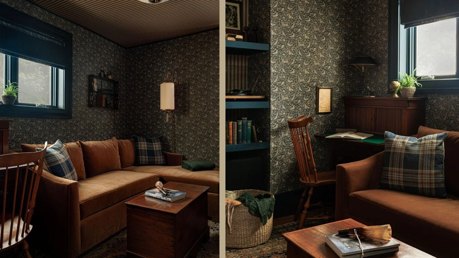
Deep blue wallpaper sets the foundation, but it's the soft lampshades, mustard sofa, and textured fabrics that actually create the cocooned atmosphere.
In our recent Oakwood project, the one featured on the cover of Walter Magazine, we created a snug room that photographs as deeply cocooned and dramatic. In person, it feels like the warmest hug. The deep, inky blue wallpaper sets the foundation, but what actually creates that moody atmosphere is the layered lighting, the mustard sofa, the textured fabrics, and how all those elements work together. When the clients first walked in after completion, they didn't say "wow, it's dark." They said it felt like being wrapped in comfort.
The Elements That Actually Create a Moody Atmosphere
Paint color gets all the attention when people talk about moody spaces, but it's really just the foundation. I've seen gorgeous deep greens and navys that feel lifeless, and I've seen lighter rooms with tons of atmosphere. The difference comes down to what you layer on top of that color:
Lighting is everything (and it's what you never see in photos). Interior photography usually shows rooms with the lights off. But in real life? Lighting is probably the single most important element. I'm talking about indirect lighting: table lamps, floor lamps, sconces, picture lights. These create pools of warm light that make a room feel intimate and lived-in. In that Oakwood snug, the deep walls would have felt oppressive without soft lampshades and directional sconces that make the fabrics glow. That's not something a paint color can do alone.
Color saturation matters more than darkness. When I talk about moody colors, I usually mean desaturated, earthier tones—color that's been grounded with neutrals, something a little muddy. We're still using plenty of color, just not bright, super vibrant schemes. A muted sage or dusty ochre can create just as much mood as a deep navy.

Dark olive green accents on the island and cabinet bring grounded depth to this neutral kitchen without overwhelming the space.
In the Walter kitchen project, the overall palette was pretty neutral, but we incorporated dark olive green into the island and one cabinet as an accent. It wasn't a dramatic transformation, but that grounded color brought depth and personality that felt intentional rather than trendy.
Texture and materiality add depth that color alone can't achieve. Think linen curtains that soften windows, wool rugs underfoot, velvet on seating, and the patina of vintage wood furniture or aged metal finishes. In the Oakwood living room, we reupholstered inherited chairs with butter-colored fabric and added a fringe detail. That tactile quality is what makes you want to settle in and stay. It's what makes a space feel collected and personal rather than styled for a photo shoot.
Desaturated, earthy tones and layered textures create atmosphere without darkness. Moody design isn't about how dark the walls are, it's about the feeling you create.
Pattern and layering create visual complexity. In that same Oakwood project, we started with bold botanical wallpaper in the entryway—layered florals that became our visual anchor. From there, we mixed larger motifs with small-scale geometrics and rich textures softened by delicate weaves. This collected, eclectic approach is what makes a space feel like it has a story.
The paint color is just the foundation. The mood happens when you build on it.
Moody Doesn't Mean Dark (Or Even One Specific Look)
There's a common misconception that moody automatically means dark. But I work on a spectrum. I'm certainly not always doing a dark and moody palette. There are themes that come up again and again in my work—layered patterns, collected vintage pieces, those desaturated color tones—and those can live just as easily in a lighter, neutral space as they can in a more colorful, atmospheric one.

Desaturated, earthy tones create atmosphere without darkness—moody design works across the spectrum from light to deep colors.
To me, a moody space makes you feel a specific mood and has a little drama to it. That's why one of the first things I do with clients is think about how they want to feel in each space of their house. Maybe in their bedroom, they want to feel really relaxed. In their living room, they want to feel social and invigorated. In their office, they want to feel creative.
Getting at the literal mood you want in each space can then lead to a design that brings about that feeling, and it doesn't always require dark walls to do it. Using contrasting colors and interesting palettes can create a real vibe without darkness.
If you have a room without much natural light, that's actually the perfect place to go moody with deeper colors. There's this misconception that dark spaces need light paint, but white and pale pink fall flat without natural light. You're better off leaning into it with either a mid-tone or darker tone on the walls. Make it feel cozy rather than trying to force brightness that isn't there.
Why This Works in Southern Homes (Yes, Even in Warm Climates)
People worry that moody, atmospheric spaces don't belong in warm climates—that rich colors and cozy feelings are only for cold-weather homes.
But you can absolutely create moody spaces in warmer climates. You just approach it differently.
Maybe you're not using heavy cabin motifs and thick wool everywhere, but you can still create atmosphere through layering and pattern mixing. You can still create spaces that feel cocooning and intimate, just in a way that makes sense for how you actually live in North Carolina.
The couple in the Oakwood project had fallen in love with European snug rooms—those small, cozy retreats—and worried the concept wouldn't translate to bright, warm Raleigh. But we made it work by focusing on what actually creates mood: layered lighting, textured fabrics, and intentional color choices.
When design grows from the people who live there and the character of the home itself, it never feels forced or trendy.
Designing for Your Actual Life (Not for a Magazine Shoot)
Here's what I've learned after years of doing this work: the most successful spaces reflect how people truly live, not how they should live. When you start with your clients—their lifestyle, their family rhythms, their home’s character—you avoid clichés and create something timeless. That's when you can be more creative and more specific.
I don't push a specific style on my clients. I spend time understanding who they are; chatting early on, being in their home, seeing how they're living, and meeting their family.

This River Forest home went from all-white to richly layered with color, creating spaces that finally reflected the family's personality.
In my River Forest project, the home was neutral and white before we added color throughout—a dramatic transformation. But what made my clients happy wasn't following some moody design formula. It was creating a space that felt like a stronger reflection of who they are.
That's what this is really about.
What About Resale? What About Commitment?
I get this question a lot: "Will committing to color hurt my resale value?"
If you're genuinely concerned about resale or won't be in your home long, playing it safer with color makes sense. I'm not going to push bold choices if you're not ready for them.
But if you're not thinking about moving anytime soon? You should love your house while you're there. You can always repaint before selling. For the time you're actually living in the space, you deserve a home you love.
Creating Homes with Soul
Moody design isn't about copying a specific aesthetic or recreating what you saw on someone else's Instagram. It's about creating spaces that feel authentic, personal, and genuinely yours.
It's about understanding how you want to feel in each room, then building a design around that feeling through thoughtful use of color, lighting, texture, and pattern. It's about listening to the story of your home and the people who live there, not imposing someone else's style onto your space.
If you've been thinking about bringing more personality into your home — or you're tired of spaces that feel generic or don't reflect who you are — I'd love to talk through what's possible. You can explore more of my work in the portfolio, or reach out about a design consultation to see how we might create something that feels deeply personal to you.
Your home should feel gathered, authentic, and unmistakably yours. Sometimes that means trusting the process, being open to more color than you thought possible, and focusing less on what photographs well and more on how you want to feel when you walk through your door at the end of the day.
